February 27, 2013

a parade of flowers

it's been raining since morning. my daughter and i stayed home and painted all day. here's one of the things that she made:


as for me, i made more flowers.

i am enjoying this new blogging pace. it gives me enough time to get some meaningful work done, and keeps me motivated, focused, and inspired to try new things. this weekend i started designing the motifs for a "bold" flower pattern. my wall is now covered with marching flowers:

bold flower motif development

and here are the fittest that survived and made it to illustrator:

bold flower motifs edited in illustrator

i am not sure what this pattern will end up like, but i want to call it "flower people" as opposed to the other day's "flower sticks"

the playful pattern in the series is next. i love the sight of a blank page, and i am looking forward to a few productive hours tomorrow.

February 25, 2013

the evolution of a flower stick

flowers are everywhere in the studio (which consists of my desk and chair). not real ones, more like the stick-figure-flowers shown below (i actually don't like to have flowers or plants around me - with very few exceptions).

flower sticks, sharpie marker on paper

i had started working on a 50's inspired floral collection a couple of weeks ago. i am glad that the first pattern in that collection is finally taking shape. here's a snapshot of my wall showing how my concept for the above motif evolved.

concept generation process for floral motifs

in the middle are the initial gouache sketches i shared a few days ago, to the left is a basic lilly pond idea inspired from those sketches,  and to the right are the more evolved flower sticks. i like to think of my style as being simple, bold, and playful, so to get this collection going, i decided to come up with three patterns, each displaying one of these characteristics. so these are my simple flower sticks. i drew several of them, scanned them, used the "live trace" tool in illustrator, and here i was, with a bunch of motifs to choose from (they might all look the same, but they are not, obviously).


flower stick motifs live traced in illustrator

in order to make each motif look exactly the way that i wanted, i went in and edited the paths by adding/deleting/moving/modifying anchor points. below are before and after snapshots of the same motif.

flower stick motif, before
flower stick motif, after

once i had around 10-12 motifs i liked, i was ready to move them around and play.

flower stick pattern development

here's where i got after a few hours of play. i have to say it is not as simple as i usually like it to be, but i am trying to stick to my 50's mood board, so overlapping some motifs seemed necessary. eventually, i might decide to ignore the 50's and trend forecasts altogether, but for now, i am following my self-imposed guidelines.

simple flower sticks pattern in repeat

either way, i love making patterns.  to me, it's all play and no work!

February 22, 2013

less talk, more do

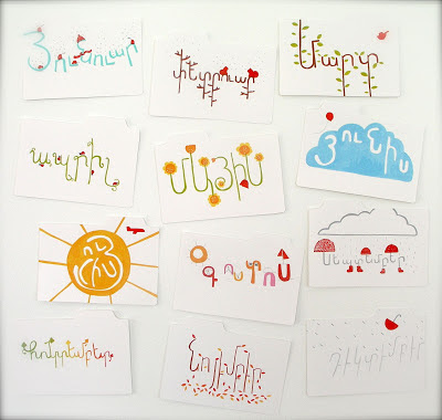
today i realized i am really behind in one of my most important goals: the design of my website, which i want to launch in mid-march. i decided to dedicate the next couple of weeks to getting all my collections ready for the website. but before embarking on this giant project, i wanted to complete an unfinished one. below are the 12 tabs for our family's 2012 photo box i had started working on when i began blogging three weeks ago.

2012 photo box tab project

i will need every free minute i have to accomplish this goal on time. so i have decided to blog a little less often - after all, the purpose of this blog is to help me focus on my goals, not keep me from achieving them. for the time being, i will be blogging on monday, wednesday, and friday evenings. in case anyone out there is following this blog, you can like my page on facebook, follow me on twitter, or subscribe to this blog by clicking on the links to the left, if you wish.

oh, and my favorite tab is the one for the month of june (blue cloud and red balloon).

February 21, 2013

the handwritten project

today i decided to take a break from flowers, because after working on the same project for a few days, i like to take a step back, not think about it, and then come back and look at my work with a more critical eye. so i tried something i have wanted to do for a while. my hand lettering skills are pretty basic, not to say non-existent, so i normally use fonts made by others instead of coming up with mine. the other day i came across illustrator Madi Barret's blogpost about a great online tool called MyScriptFont that lets you create a font with your own handwriting (you will need a printer and scanner). so i gave it a try today, and you can see the result below. not really happy with it yet, and it looks a little different from my actual handwriting, but i think it's a good start.


(note: when trying this at home, be aware that the template has two parts. you need to fill out all the spaces in the first part, while the second is optional, and there you can fill only the characters of your choice. i wasted a lot of paper until i figured this out!)

recently, i started keeping a font journal that i call my "little book of fonts". whenever i see a font i like in a magazine or catalogue, i just cut it out and stick it in my notebook.


i am planning to use these fonts as starting points for any hand lettering i do in the future, because i really don't know where to start sometimes.

and finally, i know there will be times when i really want a font i have seen, and no hand written type will be able to replace it. so here's a very handy tool that i use to identify a font and purchase it: myfonts.com has this great feature called WhatTheFont, where you upload a font you have scanned, and it identifies it for you and offers other similar fonts as well. this is what i did when i was searching for the ideal font for my logo. i had bought this book for my daughter, and i loved the fun, immediate, and handwritten feel of the type they used. (and yes, she does wear diapers...)

do you wear diapers published by blue apple books

i wanted to buy the font, but had no idea what it was. so i scanned just one word, and uploaded it to the myfonts.com website. in less than a minute, at last, i had found what i was looking for!


as i was working on this post, i got distracted, as usual, by other blogs i follow. i am glad i did, because today Esther Cox, a designer and illustrator based in brighton, uk, has also blogged about handwritten type, and it's always a treat reading her posts. her blog is full of witty insights, thoughtful discussions and inspiring photos and links. just click here to see what i mean! enjoy!

February 20, 2013

little flower people

here's what i look at every morning, when i drink water or orange juice:


it's a glass we got in barcelona years ago, and i love the movement and playfulness of joan miro's figures. although i didn't end up uncluding miro's work in my 50's floral collection moodboard, i feel the sketches i did today are directly influenced by my morning ritual. i went back to yesterday's pencil drawings, and started painting some of the motifs in gouache, just to see how they would read when rendered in thicker lines. here's what happened:

motif development day 2 | acryla gouache on bristol paper

floral motif sketches,  detail

i am starting to think of these motifs as "little flower people", how does that sound for a collection name? i have to say it sounds more playful than "the penalties of hell", which is the title of miro's lithograph above, i just found out. but i still like to think of them as little people running around my glass of water every morning, and i hope that's ok.

February 19, 2013

the corner of my desk

as i said yesterday, i couldn't wait to start developing the motifs for the 50's inspired floral collection. so that's just what i did, and i have to say this is the part that i enjoy most. i love drawing the same motifs over and over, and seeing how they evolve. it is a very intuitive process for me, and i love every minute of it. below is a snapshot of my desk today.

floral collection motif development (and Ikea PATRULL corner bumper in case you're wondering)

i sketch on a pad of white paper, it gives me the freedom to immediately discard drawings i don't like. at the end of each project, i collect all the loose sheets of paper and keep them in a separate folder. the small sketchpad is always in my bag, for drawing on the go. a sketchpad as opposed to a sketchbook gives me the option to tear the sheets and keep them with the rest of my drawings. for example, these ball point pen sketches were done while waiting for my haircut appointment today. after many years of wasting a lot of money on specialized sketching tools and sophisticated looking sketchbooks, i finally came to the conclusion that my favorites were the mechanical pencil, ball point pen and just plain old white paper.

now, if you allow me, i will stop typing and go back to drawing. 

February 18, 2013

in the mood for flowers

first things first: today was the birthday of a very creative friend of mine, so we needed a cool gift wrap. the other day aiki (my 2 year old daughter), with some help from her resourceful daycare teachers, had printed heart shapes for valentine's day using a cardboard roll. i thought it was a very clever idea and we used the same technique to make our gift wrap.


so that's what she was up to. what did i do? other than planning, setting up, guiding, supervising, encouraging, and cleaning up?

i am happy to be finally able to say that i have been working on this moodboard for the 50's inspired floral collection i am currently working on.

50's floral moodboard | 1. alexander calder,  tapestry 2. alexanader calder, blueprint for mobile 3.  marianne mahler, linear flowers 4. lucienne day, plantation 5. marianne mahler 6. ruth adler schnee, lamplights 7. paul klee, park bei lu 8. paul klee, fruits on red 9. alexander calder, mobile | colors and names from pantone fashion color report fall 2013.

while i am not really sure how effectively my moodboard captures 50's floral patterns, i like how it focuses on the influences of textile designers of that period. obviously, it's not supposed to be a comprehensive visual summary - and of course i focused on the characteristics that most suit my style; simple, bold shapes, thick lines, grid like arrangements, yet a sense of playful movement. the overlapping motifs and shapes will be a challenge for me, because i usually prefer solid backgrounds. but i welcome restrictions, since i am not able to create anything i consider to be valuable without specific boundaries and purpose. sticking to this moodboard will be tough, but i think it may result in better design. 

the color palette is based on the pantone fashion color report for fall 2013, which can be downloaded here. i envision that the orange and purple will create a warm mood, while accents in green will add playfulness and lightness. the dark gray is a good color to have if i want to balance things out. and i thought black and white would be necessary to evoke the 50's. 

but i started to sound too serious! the truth is i am not sure about any of this! all i want to do now is start developing motifs. the rest will come later, and we'll see if anything i said will still hold once i'm done. 

February 15, 2013

good day, bad day

first, the good news: i woke up today to a happy tweet!


you can read more about my "love is in the clouds" banner here.

well, that's it. that was the highlight of my day.

i did finally get around launching a facebook page for studio aliQue - not a very exciting task, to be honest, but necessary. that's all. and that, i guess, is the bad news.

studio aliQue facebook page

facebook, twitter, blogger, pinterest, so important and useful, but also so time consuming. i was debating whether or not to blog at all tonight, given the fact that i didn't really create anything new although i did have all the good intentions to - but ran out of time. i chose to blog, because not everyday can be a good day, and i see no point in hiding the bad days, just for the sake of looking good.

i will be back on monday with new work. i have to.

February 14, 2013

my ever-expanding lists

i have many, many "to do" lists. one for things that need to be done around the house, one for my illustration work, another for my pattern designs, one for stuff we need for our daughter, one for projects i want to try one day, one for the things i need to remind my husband to do, and of course, a "to do before the baby arrives" one (and this is by no means an exhaustive list of my lists!).

one task on that list was to make a bag for this adorable toy by MUJI my sister got our daughter last year (shown below). i didn't want to keep the little wooden animals in the cardboard box they came in, so i decided to print a couple of stencils on a little canvas bag i had, both to decorate it and to identify its contents.

safari wooden toy by MUJI

[true story: another item on this "before baby" list was to hem my pyjama pants with a sewing machine - something i had neither done before, nor had a clue about how to-  and in my urge to check tasks off that list as soon as possible, i did that around the time we were packing our things, getting ready to move to our new place. it was midnight, i was surrounded by cardboard boxes, squinting continuously, and swearing occasionally, bent over the machine as if my life depended on it!]

now back to the stencil project:

the work of one of my design heroes, lotta jansdotter is a constant source of inspiration to me. so i opened up her stencils kit (shown below) which has very clear instructions, and finally did it. of course, i had slowly gathered all the materials i would need in advance, in anticipation of this little window of time.

so here's what i did.

followed the instructions by lotta jansdotter in Stencils, published by Chronicle Books

traced a couple of toys on a white piece of paper

placed a clear plastic folder on the drawings and traced again with a sharpie

 cut out the stencils

placed the canvas bag (washed and ironed) on a padded surface i had made with a wooden board, batting fabric and a piece of canvas. then i printed the large elephant, applying two coats.
checked the quality of my print before removing the stencil

repeated the same steps for the little elephant

the little wooden animals have a new home!

i loved doing this. it's a really quick and relatively easy method to print and it results in instant gratification. now i can't wait to make stencils with my own designs and print on aprons, dishtowels, and why not, the walls!! funny how i crossed out one task off my  list, and added 10 new ones!

but isn't that the whole point?

February 13, 2013

this blogging thing is a good thing

i had big plans for today, like finishing the moodboard for my 50's inspired floral collection. but for some reason i woke up at 3am and couldn't go back to sleep. all day i couldn't wait for my daughter to nap, so that i could nap myself, which i did, but not before painting this tab for my photo box.

september tab for photo box

if i didn't have this blog, i don't think i would have found the energy to draw even one raindrop! i wanted to have something to share at the end of the day. i could write 5 posts about how much fun we had with my daughter today, but that's not what this blog is about. i am very happy that blogging kept me somewhat motivated even when all i wanted to do was sleep.

good night. 

February 12, 2013

three contradictions and a surprise

let me start by saying that i did nothing creative today. the weather was relatively warm, so i decided to go window shopping with a purpose. we need a rug for our daughter's room, and i wanted to check some out. the truth is i love things, but i hate shopping for things (contradiction №1). so when i go shopping, i must have a really good reason to. i ended up visiting many stores that had nothing to do with rugs, and it felt more like a trip to art galleries than a shopping one.

1. retro floral umbrella by jonathan adler 2. lil mo ladybug family rug 3. wrapping paper rack at papersource 4. päärynä mugs by maija and kristina isola for marimekko 5. vera canning dishtowel by vera neumann 6. johnny depp and juliet landeau in ed wood by tim burton at trident booksellers and cafe at 338 newbury street boston

contradiction №2: i don't like shopping for things i need, but i love buying things i don't really need. here's what i left the marimekko store with. i just couldn't leave empty handed!

puutarhurin parhaat (the gardener's best yield) and räsymatto (rag rug) by maijia louekari for marimekko

even though it took up a lot of my time, i am glad i went window shopping. first, i walked for 3.5 hours. second, our downstairs neighbor will soon be grateful for a rug in our daughter's bedroom. finally, i wanted to come back and research the products i had seen, so that i could write this post. which means this blog is serving its purpose: it is helping me focus on what i love to do.

the only thing i am not really happy about is that all the stores (except my final stop at trident booksellers and cafe) were big names, or chains. but i will make up for this one day by posting about local and independent shops that i love. for someone who doesn't like shopping, i know quite a lot of shops! that's contradiction №3.

and here's the best thing that happened today. my umbrella was recently stolen, so tonight my husband came home with this! 

joonas umbrella by maija isola for marimekko

i just love it. it is one of my favorite patterns ever. apparently she designed it standing over rolls of paper, while listening to pop music. now i can't wait for the rain!

February 11, 2013

love is in the clouds

last night i found out that the wonderful tigerprint studios are accepting valentine themed submissions for their homepage banner. so that's what i worked on today. i sketched my composition out, and then drew everything again in photoshop. it took me exactly 2.5 hours. did i time myself? no, but i did time my daughter's nap!

valentine's day tigerprint banner  in progress 

my submission to tigerprint (without my logo) | text/font provided by tigerprint

tigerprint rotates the submitted banners on their homepage, and if you click on a banner, you are guided to the carousel gallery where all the entries are displayed (mine isn't up yet). if you want to find out about a specific banner's designer, you can simply click on it. thank you, tigerprint!

February 10, 2013

something new, and a new schedule

this weekend was good for starting new projects. today, i moved on to something new. literally, i am illustrating and designing a DVD sleeve cover for a short documentary by that title, produced by an environmental education institution. i realized that i still haven't shared any of my illustration work on this blog, so here's a peek into my process. below is a page of thumbnails that show how i start developing a concept. i had nothing at the beginning, but towards the end, i feel i am on to something.

thumbnails for something new

i also made a new decision regarding my blog. inspired by fellow designer tammie bennet, i have decided not to blog on weekends - i want to spend the weekends away from the laptop, enjoying my time with my family, friends, and neighbors. if anything super exciting happens, i can always share it on monday. so starting this week, this blog will be updated monday to friday.

i will switch off my laptop after i publish this post, promise.

February 9, 2013

designing to trends: to do or not to?

i am not someone who follows trends, but i realize that as a surface pattern designer i need to show some knowledge of them. so i have been debating whether or not to create a collection based on a trend that suits my style. since my portfolio is lacking in the floral department, i decided to challenge myself and research trends for F/W2013, and then come up with a collection, even if it's too late, more like an exercise. the end result will be one more collection in my portfolio, and that can't be a bad thing.

don't ask me how these things work, but i came across a 50's floral trend report, and really liked the idea, mainly because lucienne day and marianne mahler are two of my favorite textile designers.

so today i spent most of my time either curled up on the sofa reading the "contemporary" chapter in twentieth-century pattern design by lesley jackson or at my desk pinning like mad on pinterest.

one of my favorite books

lucienne day | perpetua | 1953

marianne mahler | linear flowers | 1953

jacqueline groag | 1953

ruth adler schnee | seedy weeds | 1953-4

what i found out was that what's referred to as "contemporary" pattern design was influenced by another set of artists i admire: paul klee, alexander calder, joan miro and jackson pollock. in my visual research, i decided to leave out pollock, because of my preference for clean lines.

alexander calder

paul klee | fruits on red | 1930

joan miro |  collage | 1929

now i have a good collection of images for my inspiration board. the trick is too be inspired and influenced without loosing my own voice. i came across this great quote by zika ascher (founder of ascher london): "the most successful designers are those who effortlessly express their own personality in their designs."

makes me wonder if i should forget about all this research and just be myself!

February 8, 2013

seashells in the snow

it's been snowing since mid-morning, so daycare was closed today, which means i didn't have as much time as i thought i would. my plan to create new work will have to wait until tomorrow. this doesn't mean that we slacked all day (slack we did, just not all day)! we made this clay tablet with my daughter, something i had been meaning to since we came back from greece last summer. we pressed the seashells she had collected into a slab of clay, and it made us dream of summer.

seashell project

speaking of summer, i'm glad i was able to work on the june/july/august tabs for the photo box. three more tabs to go and i can cross this one off my list!

summer months photo box tabs